Overview
Design commission and branding project within the airline industry for a pilot training examiner using subtle but interesting symbol visual language. Get in touch if you would like to commission a design.
Contact MeRequirements
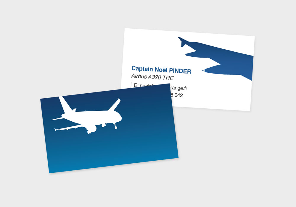
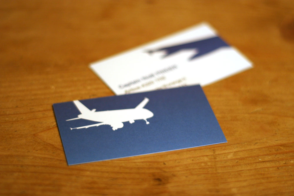
Design required a high symbolic impact with minimal elements. Design concept was to place the client (viewer) in the place of a passenger looking out the window whilst travelling but focussing view on contact information. On the reverse is a symbol of an aircraft moving towards or moving away from the viewer.
Features
- Brand design
- Visual identity
- High quality 300dpi print
- 350gsm CMYK colour
- Coloured fills